PositronAutomatorPolitical Science
Published
Author Andrew Heiss
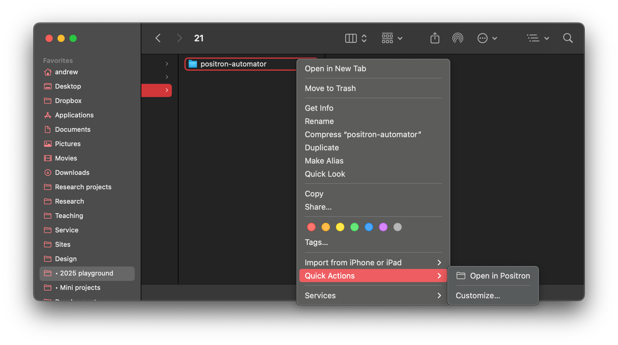
tl;dr Download and unzip this: “Open in Positron” Quick Action Put Open in Positron.workflow in ~/Library/Services. Now you can right click on folders in Finder, go to Quick Actions, and select “Open in Positron” to open folders as projects in Positron. One thing I’m still adjusting to in Positron is how it treats projects and folders.