I always forget how to deal with logged values in ggplot—particularly things that use the natural log.
Downloadable cheat sheets! You can download PDF, SVG, and PNG versions of the diagrams and cheat sheets in this post, as well as the original Adobe Illustrator and InDesign files, at the bottom of this post Do whatever you want with them!
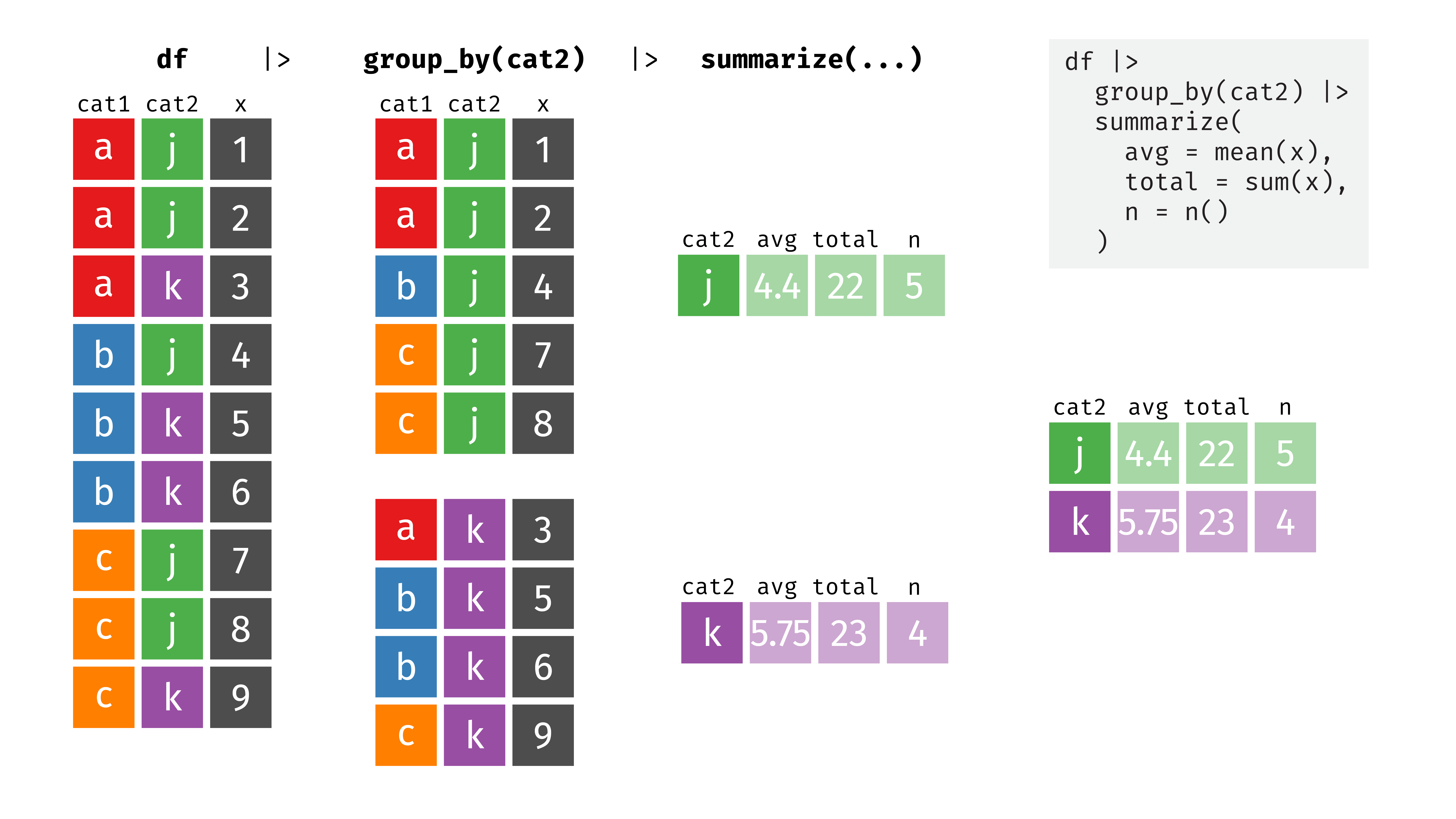
In one of the assignments for my data visualization class, I have students visualize the number of essential construction projects that were allowed to continue during New York City’s initial COVID shelter-in-place order in March and April 2020. It’s a good dataset to practice visualizing amounts and proportions and to practice with dplyr ’s group_by() and summarize() and shows some interesting trends.
(See this notebook on GitHub) A year ago, I wrote about how to use R to solve a typical microeconomics problem: finding the optimal price and quantity of some product given its demand and cost. Doing this involves setting the first derivatives of two functions equal to each other and using algebra to find where they cross.
(See this notebook on GitHub) Taking a sample from two groups from a population and seeing if there’s a significant or substantial difference between them is a standard task in statistics.
I am so beyond thrilled to announce that I’ll be joining the Andrew Young School of Policy Studies at Georgia State University in Fall 2019 as an assistant professor in the Department of Public Management and Policy. I’ll be teaching classes in statistics/data science, economics, and nonprofit management in beautiful downtown Atlanta, and we’ll be moving back to the South. I am so so excited about this!