Computer and Information SciencesBlogger

iPhylo

Rants, raves (and occasionally considered opinions) on phyloinformatics, taxonomy, and biodiversity informatics. For more ranty and less considered opinions, see my Twitter feed.ISSN 2051-8188. Written content on this site is licensed under a Creative Commons Attribution 4.0 International license.
Home PageAtom FeedMastodonISSN 2051-8188
language
Published

In previous articles I've looked at how various apps display scientific articles. The apps I looked at were: PLoS Reader Nature Papers Mendeley So, where next? As Ian Mulvany noted in a comment on an earlier post, I haven't attempted to summarise the best user interface metaphors for navigation. Rather than try and do that in the abstract, I'd like to create some prototypes to play with various ideas.
Published

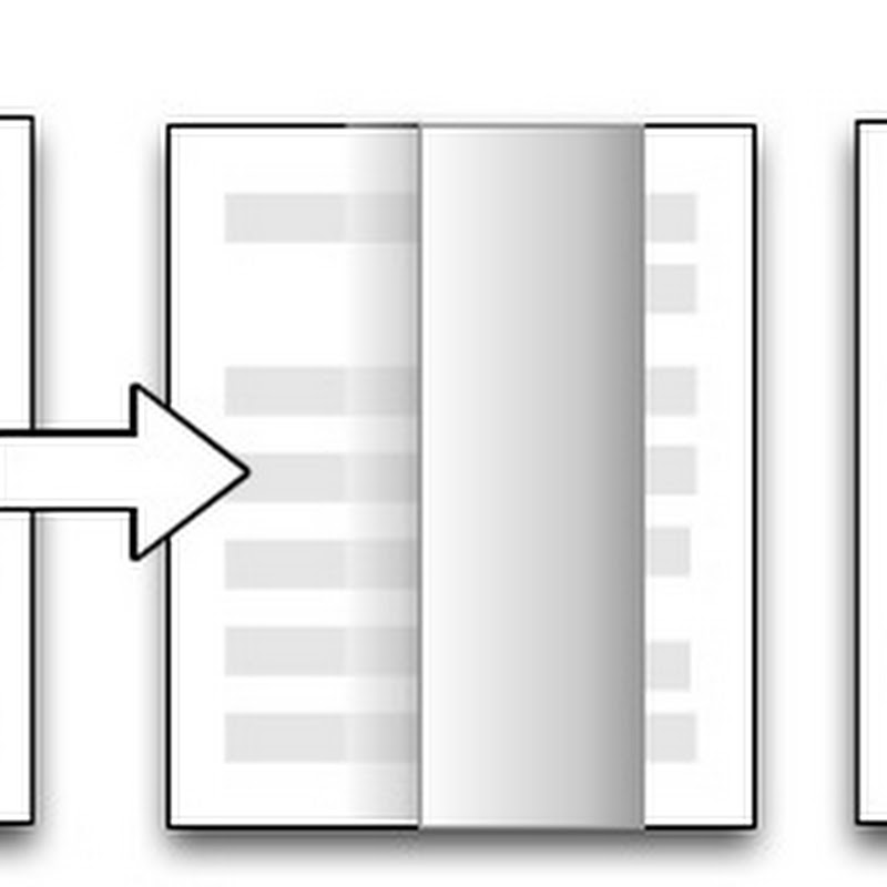
Apple's iBooks app is an ePub and PDF reader, and one could write a lengthy article about its interface. However, in the context of these posts on visualising the scientific article there's one feature that has particularly struck me. When reading a book that cited other literature the citations are hyper-links: click on one and iBooks forwards you (via the page turning effect) to the reference in the book's bibliography.

Published

Previously I've looked at the Nature, PLoS, and Papers apps, now it's the turn of the Mendeley iPad app. As before, this isn't a review of the app as such, I'm more interested in documenting how the app interface works, with a view to discovering if there are consistent metaphors we can use for navigating bibliographic databases.

Published

Continuing the series of posts about reading scientific articles on the iPad, here are some quick notes on perhaps the most polished app I've seen, Papers for iPad. As with earlier posts on the Nature and PLoS apps, I'm not writing an in-depth review - rather I'm interested in the basic interface design. Papers is available for the Mac, as well as the iPhone and iPad.

Published

Continuing on from my previous post Viewing scientific articles on the iPad: towards a universal article reader, here are some brief notes on the PLoS iPad app that I've previously been critical of. There are two key things to note about this app. The first is that it uses the page turning metaphor. The article is displayed as a PDF, a page at a time, and the user swipes the page to turn it over.

Published

There are a growing number of applications for viewing scientific articles coming out for the iPhone and iPad. I'm toying with extending the experiments described in an earlier post when I took the PLoS iPad app to task for being essentially a PDF page-turner, so I thought I should take a more detailed look at the currently available apps.