Published
Author JP Monteagudo

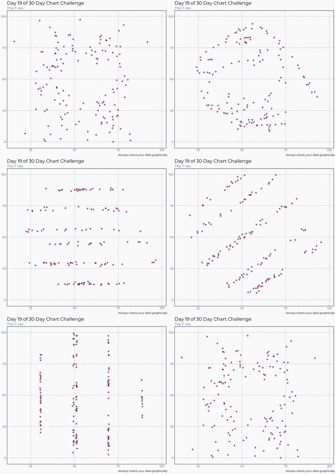
Visualization & Pearson’s correlation coefficient The 30DayChartChallenge is a data visualization community that hosts daily challenges for April. Today’s challenge involves dinosaurs. I used the Datasaurus package to create an animated visualization to demonstrate the importance of graphing data, and the effects of outliers on statistical properties.