Published in Andrew Heiss's blog
Author Andrew Heiss

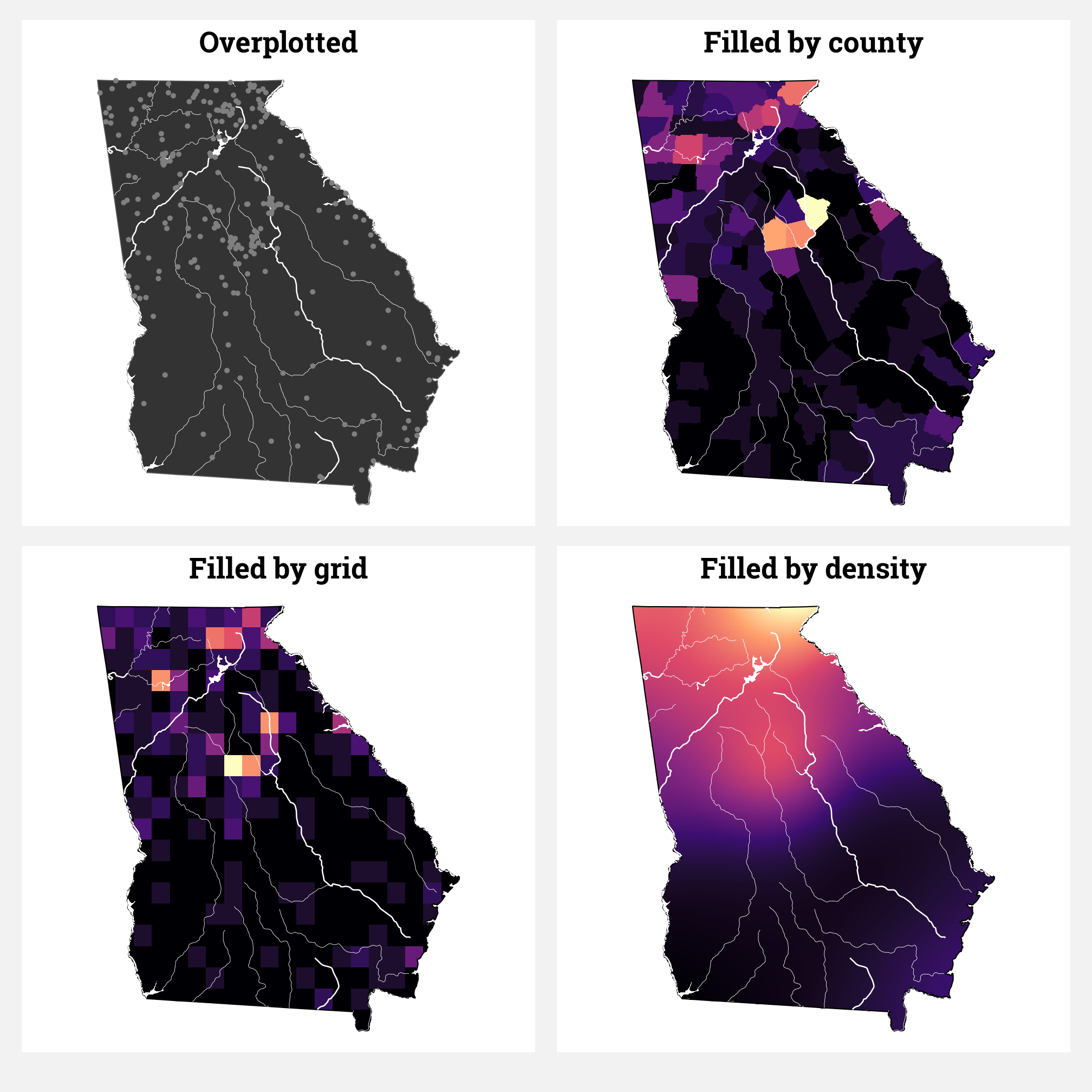
The students in my summer data visualization class are finishing up their final projects this week and I’ve been answering a bunch of questions on our class Slack. Often these are relatively standard reminders of how to tinker with specific ggplot layers (chaning the colors of a legend, adding line breaks in labels, etc.), but today one student had a fascinating and tricky question that led me down a realy fun dataviz rabbit hole.