Published in Data & Molecule Bits
Author Giorgio Luciano

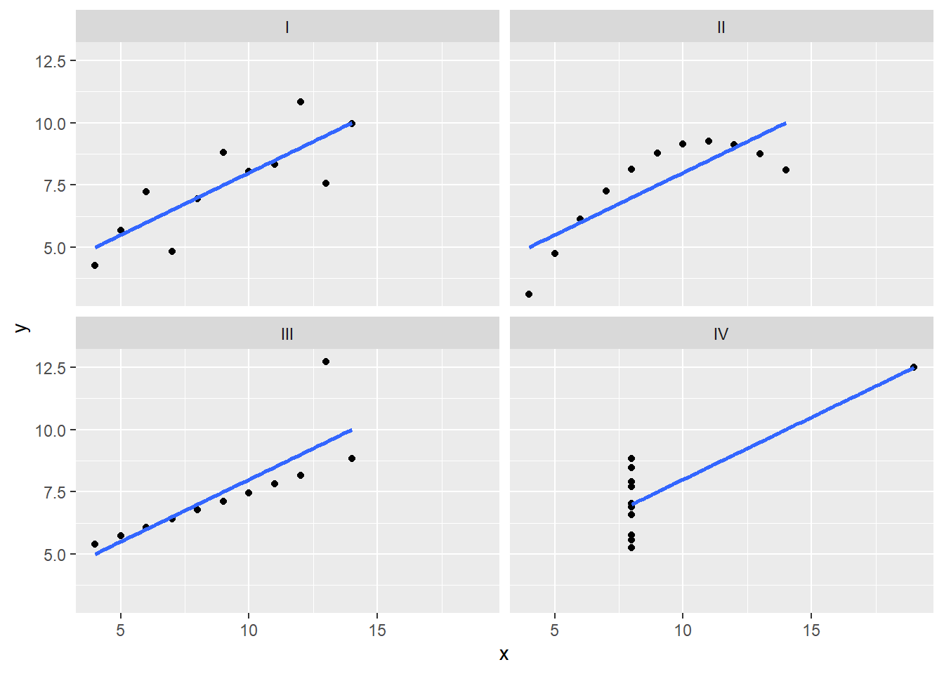
Anscombe’s Quartet, known as the “Anscombe’s Test,” consists of four datasets with very similar descriptive statistics but visually distinct characteristics. These quartets serve as an enlightening example of the importance of visualizing data before drawing conclusions. In this post, we will delve into how to calculate and visualize Anscombe’s Quartet using R and the powerful ggplot2 library.