Published in Andrew Heiss's blog
Author Andrew Heiss

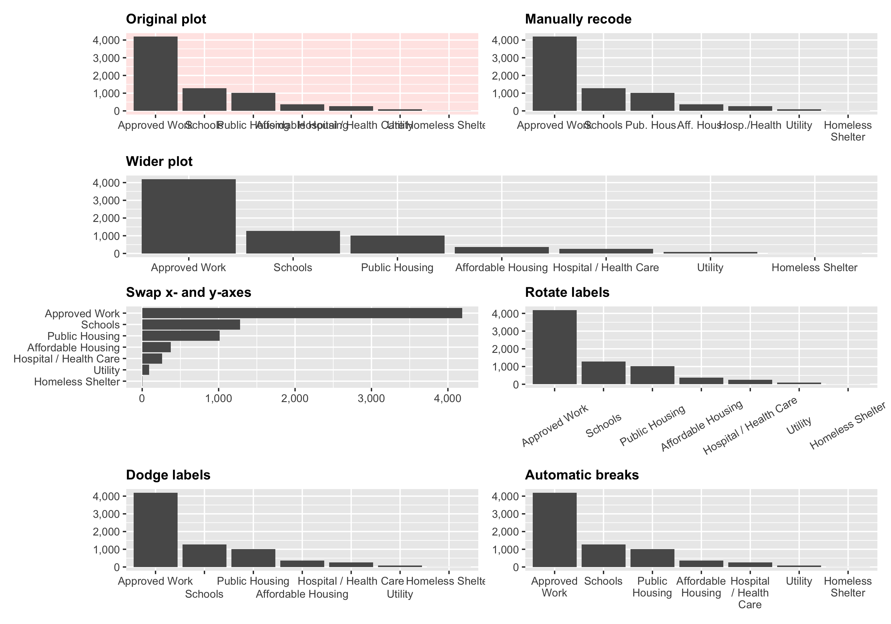
In one of the assignments for my data visualization class, I have students visualize the number of essential construction projects that were allowed to continue during New York City’s initial COVID shelter-in-place order in March and April 2020. It’s a good dataset to practice visualizing amounts and proportions and to practice with dplyr ’s group_by() and summarize() and shows some interesting trends.