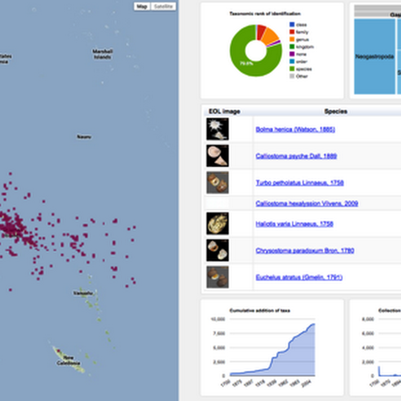
Following on from the previous post on visualising GBIF data, I've added some more interactivity.

Following on from the previous post on visualising GBIF data, I've added some more interactivity.

Having made a first stab at mapping NCBI taxa to Wikipedia, I thought it might be fun to see what could be done with it. I've always wanted to get quantum treemaps working (quantum treemaps ensure that the cells in the treemap are all the same size, see my 2006[!] blog post for further description and links). After some fussing I have some code that seems to do the trick. As an example, here is a quantum treemap for Laurasiatheria.

A quick, and not altogether satisfactory hack, but I've added a simple interactive treemap to BioStor. It's essentially a remake of the Catalogue of Life treemap I created in 2008, but coloured by the number of references I've extracted from BHL.

One of the things I've struggled with most in putting together a web site for the challenge is how to summarise that taxonomic content of a study. Initially I was playing with showing a subtree of the NCBI taxonomy, highlighting the taxa in the study. But this assumes the user is familiar with the scientific names of most of life. I really wanted something that tells you "at a glance" what the study is about.

I've just discovered Nicolas Garcia Belmonte's JavaScript Information Visualization Toolkit (JIT). Wow! This is very cool stuff (and no Flash). To quote from the web site: Nicolas also links to a talk by Tamara Munzner, which I've embedded below to remind myself to watch it.