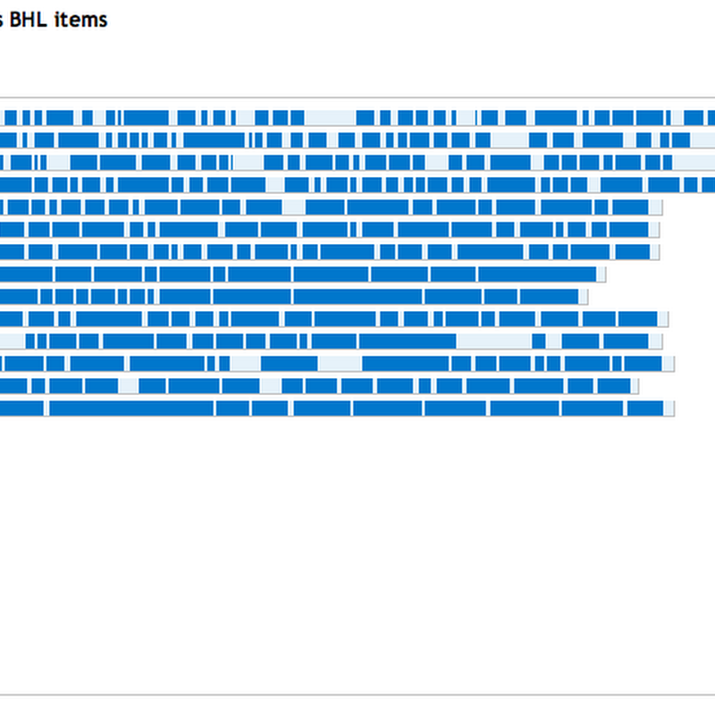
Cooliris is a web browser plugin that can display a large number of images as a moving "infinite" wall. It's Friday, so for fun I added a media RSS feed to BioStor to make the BHL page scans available to Cooliris.

Cooliris is a web browser plugin that can display a large number of images as a moving "infinite" wall. It's Friday, so for fun I added a media RSS feed to BioStor to make the BHL page scans available to Cooliris.

Some serious displacement activity. I'm toying with adding phylogenies to iSpecies, probably sourced from the PhyLoTA browser. This raises the issue of how to display trees on a web page. PhyLoTA itself uses bitmap images, such as this one: but I'd like to avoid bitmaps. I toyed with using SVG, but that has it's own series of issues (it basically has to be served as a separate file). So, I've spent a couple of hours playing with the element.

Random half-formed idea time. Thinking about marking up an article (e.g., from PLoS) with a phylogeny (such as the image below, see doi:10.1371/journal.pone.0001109.g001), I keep hitting the fact that existing web-based tree viewers are, in general, crap. Given that a PLoS article is an XML document, it would be great if the tree diagram was itself XML, in particular SVG.

A quick, and not altogether satisfactory hack, but I've added a simple interactive treemap to BioStor. It's essentially a remake of the Catalogue of Life treemap I created in 2008, but coloured by the number of references I've extracted from BHL.

Jim Croft drew my attention to a cool crowd-sourcing project to convert scans of Australia's newspapers to text. The site has a nice chart showing the projects' coverage of the Australian newspapers, which motivated me to show something similar for BioStor. Each journal page now shows a chart of article coverage.

I've been buried in programming (and it's exam time at Glasgow) so I've not blogged for a month (gasp). I've been playing with ways to visualise Biodiversity Heritage Library content for a while (click here for a list of previous posts), and have occasionally surfaced to tweet a screenshot via twitpic.

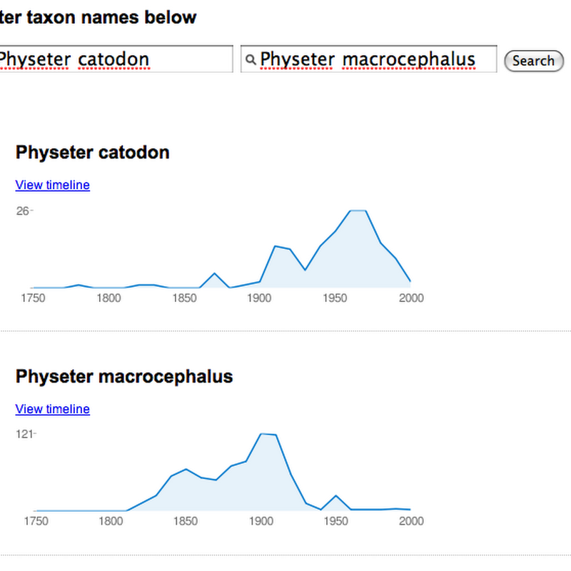
Time for a quick and dirty Friday afternoon hack. Based on responses to the BHL timeline I released two days ago, I've created a version that can compare the history of two names using sparklines (created using Google's Chart API). I use sparklines to give a quick summary of hits over time (grouped by decade). The demo is here. It's crude (minimal error checking, no progress bars while it talks to BHL), but it's home time.
Stumbled across this cool visualisation project by Petra Isenberg at Calgary University. Collaborative tree comparison uses a tabletop system to enable two (or more) people to interact when comparing (in this case) phylogenies. I want one!

Quick post (really should be doing something else). Reading Jeff Atwood's post Mixing Oil and Water: Authorship in a Wiki World lead me to IBM's wonderful history flow tool to visualise the edit history of a Wikipedia page. There's a nice paper describing history flow (doi:10.1145/985692.985765, free PDF here). Inspired by this I decided to try and implement history flow in PHP and SVG.

Following on from my previous post about visualising the mammalian classification in Wikipedia, I've extracted the largest component from the graph for all mammal taxa in Wikipedia, and it is a tree. This wasn't apparent in the previous diagram, where the component appeared as a big ball due to the layout algorithm used.